Driving traffic to your site only matters if you convert visitors to customers once they land there. Many different elements play into the conversion rate of your landing page. Fortunately, there are a few things that can optimize your page for conversions as well.
In popular industries, the average landing page conversion rate falls between 4.6 and 26 percent, with an average rate of about 9.5 percent. Understand what your industry average conversion rates are, and strive to improve until you get yours above the average.
Improving your landing page’s conversion rate optimization (CRO) doesn’t require a lot of time or money. In a single day, you can make changes and increase responses to your calls to action (CTAs). Here are six ways to improve your landing page’s CRO in a day or less.
1. Reduce Your Number of Form Fields
Using fewer form fields improves your conversion rates. In one study, reducing form fields from 11 down to four increased conversions by 120 percent. Collect only information that’s needed on your forms, reduce the number of fields and watch the leads pour in from your landing page.
If you ask site visitors for a phone number, it may leave them with a negative impression of your site. People are very protective of their phone numbers, so remove that form field unless you absolutely must have their phone number.
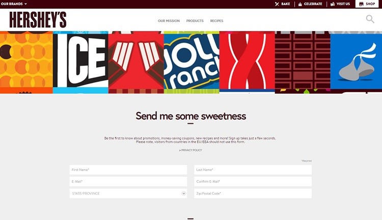
Hershey’s makes it simple to sign up for their newsletter by collecting only a few pieces of information. They keep sign-up simple, asking for just a name, email, state and zip code. The data gives the brand personalized marketing options but isn’t intrusive, so people are more likely to sign up.
2. Speed up Load Times
One of the future trends of the World Wide Web is speedy websites. With the introduction of 5G speeds, users will become impatient with pages that are slow to load. Speed up your site by investing in high-quality website hosting and optimizing images on your page. Avoid JavaScript and intricate elements, as they may not load quickly.
3. Add a CTA Button
Your call to action (CTA) button makes or breaks your conversion rate. The CTA should stand out from the rest of the page, contrasting with the other elements. However, your CTA is about far more than just the color or location of your button. The words you use for your CTA button will impact your conversion rate.
Keep the text of the button short, to the point and driven by action verbs. In addition, make it as personal as possible by using first or second person.
Features a call to action on their rotating slider. Site visitors see an image of available products in use, then the CTA invites the visitor to “shop now.” Note the changing CTA on each image, personalizing the button a bit more.
4. Use Professional and Relevant Images
The human brain processes images tens of thousands of times faster than text alone. Choose highly personalized and relevant images that drive interaction with the user. Some rules of thumb include using large images and ensuring they’re of the highest possible quality.
Images should show the functionality of your product and also be unique and exciting to users.
5. Improve Your Headline
A headline sets the tone for your entire landing page. Grab the attention of site visitors with engaging words right at the top of your page. Also, consider the typography of your headline. The text should stand out from the rest of the writing on the page and be the first thing the user’s eyes go to.
Your headline is what users look at when they’re deciding whether or not to visit your site, but a good headline also drives the customer through a sales funnel and invites them to take action that potentially converts them into a customer.
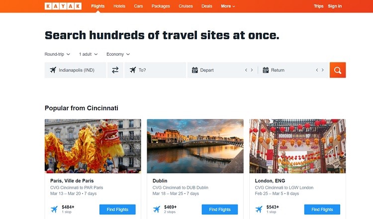
Kayak does an excellent job of grabbing the user’s interest and driving them toward action with the headline “search hundreds of travel sites at once.” Note how they place the search function directly below the headline so that the site visitor can read the headline and immediately take the action of searching travel sites.
6. Identify Pain Points
Making an emotional connection with prospective customers is challenging, but the key is figuring out where your audience’s pain points are. A paint point is a problem the user has and the likely reason they searched for a business such as yours. For example, if you own a landscaping business, remember that one of the reasons a person might look for a landscaper is that they work long hours and don’t have time to mow.
Once you have the pain point in mind, show site visitors you understand the struggle, then show how your product or service solves the problem. In the example above, you might start by saying, “Working long hours with no time for lawn care?” Then you’d go on to invite the visitor to let you help free up their time by taking care of their yard.
7. Track Conversion Rate
Conduct A/B testing regularly. Even small tweaks can improve a landing page and potentially its CRO, but the only way to know for sure what is and isn’t working is by tracking the analytics behind users’ actions on your page. If something isn’t working, make a change and conduct additional testing. Over time, the small day-to-day changes add up to better conversions on your page.


